Monday, 1 August 2016

Assignment 5 preparation

Assignment 5 preparation 2016


Initial preparation

I'm not sure if you received the word docs which I put in dropbox in January re assignments 4 and 5 ideas (critical review and personal project)?

I am at a point where I need to start on both. I think they both link with collective memory and identity.

I have been to the location for my planned assignment 5 (and the forestry commission and the MOD have moved in!) So my area to photograph will be larger to encompass this but I don't think it will matter too much because I have given the title scope by talking of Sherwood Forest. I can adjust the rest to suit. 

I have 3 updated ideas of how to photograph my proposal:

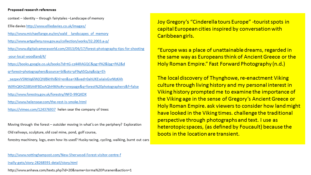
1. based on the work of Joy Gregory's Cinderella tours Europe, I would use Viking shoes (re-enactment) using the forest instead of European landmarks. Walking through time as a metaphor (Thynghowe way was Viking A1 and the route marched down to Nottingham to the battle and back to settlements. I may be able to pull in some deep mapping.

2. Take pictures of Vikings at Viking Festival on Saturday (and hopefully find the Viking shoes) and blend the Vikings into the changed landscape.

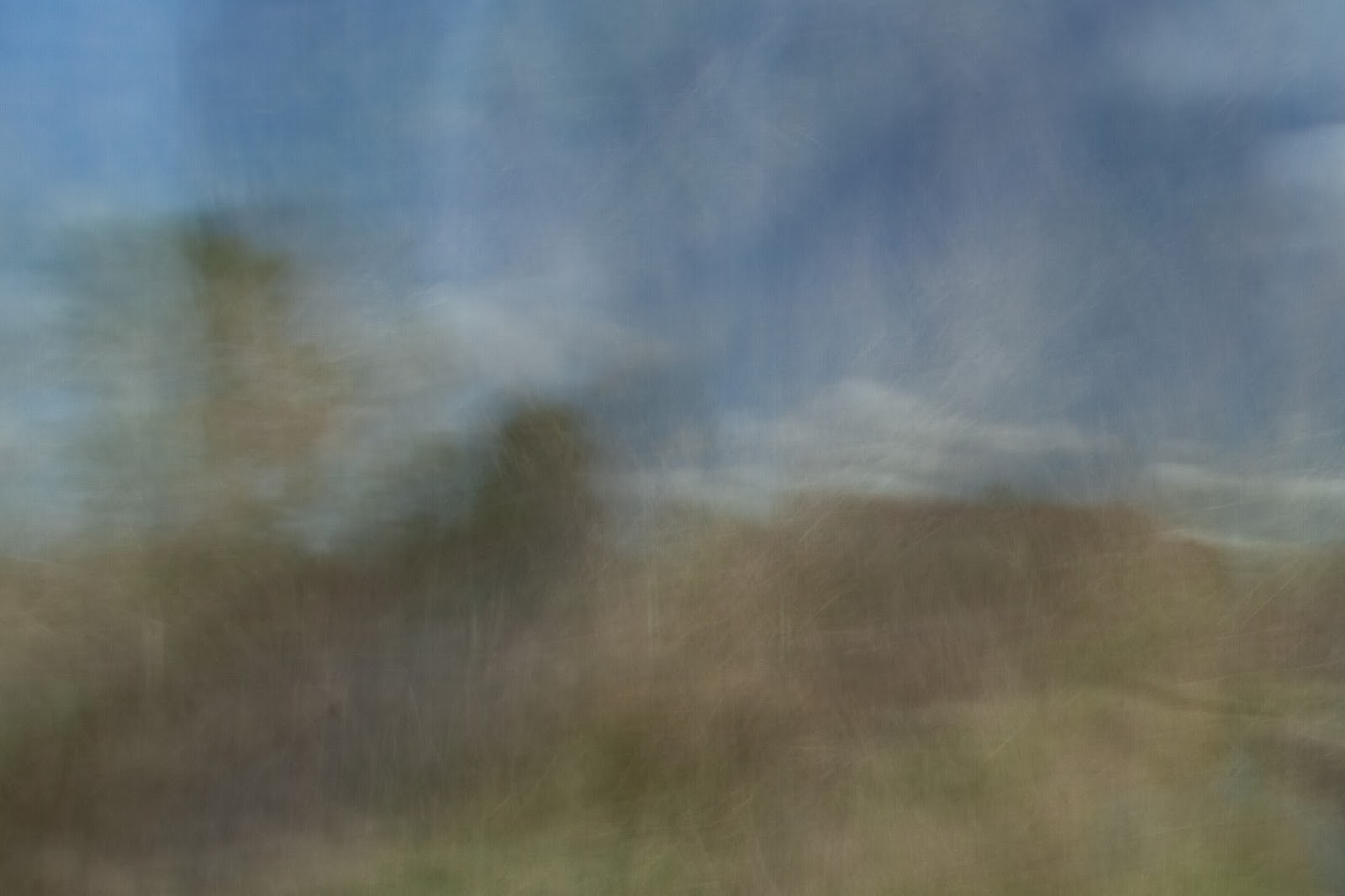
3. Intentional Camera Movement of trees in the area like Valda Bailey's work. (Not done this before) Show layering and texture and be more abstract like layering through time. 

I was going to give all 3 a go and see which worked best.

Also for assignment 6, I came across Iain Biggs in Liz Wells' Surface book which seemed to be similar to what I have done for my transitions although I can't find many of his photos on line. His area "Between Carterhaugh and Tamshiel Rigg" is associated with folklore and stories. He deep mapped the area and linked it through memory and identity. Do you think something like that would work for my assignment 6?

Hampshire, N. (2016) Assignment 4 and 5.[email]. Sent to Bloomfield, R. 17th February.


Just to briefly follow up my last email. Iain Biggs would seem to be a very good point of reference as a guide to a more textural approach including all sorts of layers beyond just the image. I've not been aware of Valda Baileys work and although experimentation like this is really crucial for developing ones own work, I find her aestheticisation of nature not exactly to my taste, but that's a personal thing! I like the physically immersive element of your first idea a lot, this is precisely what photography can lack. Looking forward to see the development.

Bloomfield, R. (2016) Assignment 4 and 5. [email]. Sent to Hampshire, N. 28th February.

Intentional Camera Movement

Based on the work of Valda Bailey, I experimented with some ICM photographs. These were difficult to achieve - and for a project like this the results are a bit hit and miss. I abandoned this idea due to frustration! Requirements - patience, a large memory card and interesting features in the landscape such as stiles and trees to make the images look different from one another. I abandoned this.



Ghosts within the landscape
Inspired by Patricia Townsend's series on "Scylla"and using her idea of transitional spaces to explore fantasy and illusion, I started to look at placing Vikings within the landscape and using the context that the past is watching you (memories) i explored old wood looking for traces of humanity. I abandoned this in favour of idea 3. This approach relied on me having taken the correct postures at Yorvik Viking Festival as I don't know anyone who is a Viking re-enactor.


Some reading material:

Wells, L. and Standing, S. (2005) Surface Land/Water and the Visual Arts. UK: University of Plymouth Press pps.28-41
Wells, L. (1994) Viewfindings: Women photographers "Landscape" and the environment.Devon: Available light pps.99-105

Boots in the landscape
Not a common image unless for a magazine.

Joy Gregory - 
Impressions Gallery

The Impressions Galley (n.d.) Joy Gregory Lost Languages and other Voices. Bradford: The Impressions Gallery. [online]. Available from: http://www.impressions-gallery.com/_lib/_user_files/Joy%20Gregory%20Exhibition%20Guide(2).pdf [last accessed 1/08/2016].

Gregory, J. (n.d.) Joy Gregory. [online]. Available from: 
http://www.joygregory.co.uk/project/cinderella-tours-europe-1998-2001/ [last accessed 1/08/2016].


Lynn Silverman - from Wells, L. (1994) Viewfindings: Women photographers "Landscape" and the environment.Devon: Available light pps.85-87
Diptych, narrow angle of view. Study of land under the photographer's feet and view of the horizon.  Monochrome. Meaghan Morris as cited by Art Gallery NSW, describes Silverman's work as " a study in the construction of inland space; how space is made intelligible for us by a play of identity and difference; how cultural systems of interpreting a space can be unsettled by exhibiting the process of framing interpretations; and how landscape photographs induce a curious convergence between what you do when you set out to see the sights and what you do when you look at an ordered sequence of images."

(Anon) (n.d.) Collection: Lynn Silverman. Art Gallery NSW [online] Available from:  http://www.artgallery.nsw.gov.au/collection/works/506.1987/ [last accessed 1/08/2016]


Internet searches revealed "Boot Camps" for landscape photographers and footwear landscape photographers should wear.
Test images based on Joy Gregory's "Cinderella tours Europe"


Email correspondence

 I have added 2 contact sheets and some notes containing my artists statement to Dropbox for assignment 5. Can I mix landscape and square images ? Could you let me know if I am working along the right lines please? I am aiming for a mix of closeup and landscape in the background. I haven't explored Joy Gregory's Peri tower image as a style as I don't particularly like that one. The dutch one is the plan for Nottingham Contemporary. I have tried to position my boots by positioning myself first in the landscape then moving the boots into position so that it looks realistic rather than still life.


Contact sheet 1
Spa ponds Clipstone – mediaeval constructed landscape – keep – shows boots detail

Sherwood sandstone – keep. Local geology is mainly sandstone influenced farming and building choices
Thynghowe – keep. Actual Viking site (just been part of an archaeological dig) Viking landscape – no trees in area
Thynghowe – shows ancient trackway – not keeping
Thynghowe – clouds – drama – keep. Shows position of law rock (marked by holly bush)

Thynghowe dig markers – keep? Better when seen as a larger image.
Sherwood forest looking at shelter - ? substitute for Major Oak – stuff of modern legends
King Edwin of Northumberland (of Edwinstowe) died 633AD in battle near here. Body buried here to hide it from Pendra Mercian King. Shrine erected site of chapel. History existed before Vikings. Religion – some Vikings turned Christian. Not much evidence found locally. Keep

Cuckney – investigating as site of battle of Heathfield where King Edwin was slain. Flood meadows system of altering the land to control water and enable crops to grow. Would have all been marshy in Viking times (Mercia = marsh) Keep
Arable fields, fence as boundary – common since enclosures act. Would have originally been hawthorn hedges and oak trees to mark boundaries. Keep

Track through Sherwood forest heath - keep
View across Sherwood Forest heath. shows slag heap from coalmine in distance ? keep

Contact sheet 2

New sculptures appearing of Vikings. This doesn’t work yet. Need to use a different post (they are all the same but in different locations) with boots on floor as an equal
Trent Bridge – Keep. Can’t use a tripod due to bridge design. May have to reshoot and leave more space around it for straightening image.
Old River Leen course – Keep. Hardly anything left now it has been re-routed so many times. Dilapidated – flourishing river unkempt. No space to stand back (parked cars) so trimmed to a square crop
Nottingham Contemporary art gallery – significance is the steps main invading route through Nottingham. Reflection- something Vikings would not have had. Also tram network, urban, bewildering. Needs reshooting possibly boots wide apart and not in focus with tram in focus
Nottingham Castle – Like sandstone caves poster with invading army in different outfit. Confusion for Vikings as it is not them but it is what they did. Reshoot to include more people. square or landscape crop?


(first draft) Artists statement
My work for Assignment 5 examines the contemporary landscape traversed by the Great Heathen Army in 868AD through modern day Sherwood Forest to Nottingham.
The Viking here is a metaphorical character, inspired by Joy Gregory (photographer – Cinderella Tours Europe 1997-2001) and my own interest in Viking history.
This series touches on documented histories of Nottinghamshire to elucidate places known to the Vikings such as Thynghowe, Nottingham, Sherwood Forest, Edwinstowe, Clipstone, Cuckney. Using a pair of re-enactment boots to bridge the timespan between past and present I have illustrated the inevitable change in the landscape brought about by man; some bewildering to Vikings if they could glimpse 1200 years into the future.

Sherwood Forest is famous for the legend of Robin Hood. Contemporary archaeological evidence suggests Vikings shared the landscape peacefully with Anglo Saxons, and art and history is currently being reshaped through archaeological digs and Viking sculptures to change our existing proclivity of a warmongering race.

Aim is to balance urban landscape with rural landscape at a ratio of 1:3
Present images from Nottingham (marched to Nottingham AD868 then settled in rural areas)
Further ideas to explore
Major oak with or without tourists
Birklands Sherwood forest – (all being tidied after recent storms)
Busy main road e.g A60 Nottingham or countryside
Nottingham Market Square
Swamp - reshoot
Ancient trackway (waiting for bluebells)
Ford (need water level to go down)
Modern day village sign of Viking place name (need leather shoe lace to sling boots over it)

Hampshire, N. (2016) Assignment 5. [email]. Sent to Bloomfield, R. 5th May.

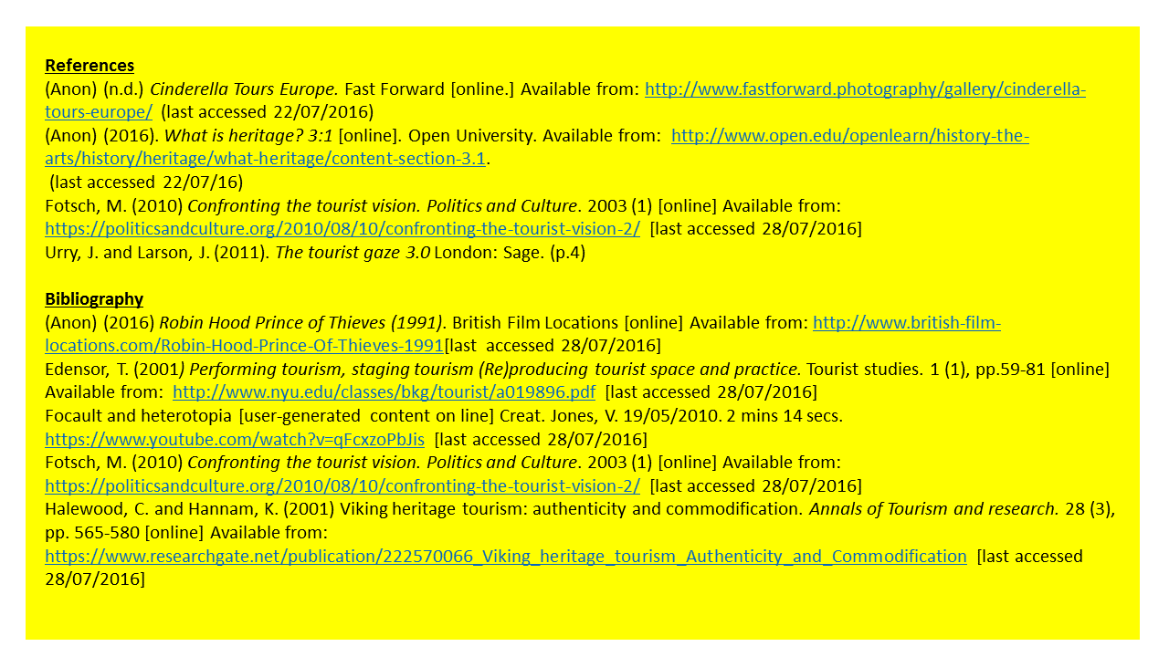
Gregory is investigating landscape within a postcolonial context but there's not much information on her website. It would be good to see those interviews for instance. Does Autograph or Iniva have anything on her? Have you thought of contacting her?
Can you identify the deeper themes across all of your investigations to broaden your artist's statement beyond assignment 5? If possible indicate your theoretical points of reference - perhaps from your essay in A4.

The Viking here is a metaphorical character

A metaphor for what? You might say the Viking is imagined standing in or walking through the landscape, or the Viking as an historical figure is represented by a pair of re enactment boots. You're questioning the representation of the Viking in contemporary culture, can you be more explicit about why?

For me there's an absurd element in both Gregory's series and your own boots in the landscape. You seem to have tried to overcome this by placing the boots in places where you've actually stood but it's still there. This is not necessarily wrong, the absurd is close to the surreal and as Sontag said, there's always something surreal about photography. 

New sculptures appearing of Vikings. This doesn’t work yet. Need to use a different post (they are all the same but in different locations) with boots on floor as an equal..
I like it, these notes show process, questioning, doubt. They have a slightly humorous edge (our struggle to create). Can you use them with the work? I'm with David Campany  - photography should be image and text, photography on its own is always somehow lost.
Square crops with landscape formats tend to move the presentation towards an installation. Conventionally stick with one format. Conventional is not creative however...

Bloomfield, R. (2016) Assignment 5. [email] Sent to Hampshire, N. 6th May.


Wednesday, 27 July 2016

Create a slideshow

June 2016

"Look at some of the audio-visual slideshows on the websites listed above. make some notes about particular works of interest, considering how they are edited, sequenced and how audio is used with the images. Note down your own personal observations.

Whether or not you intend to present your photographs for assignment 5 as an audio-visual piece, suppose that for this exercise you will. Familiarise yourself with any basic slideshow or video-making software and compile an edit of your work, experimenting with transitions, text and music and/or sound effects. Save your work so that your tutor and/or assessor can view this if necessary. Write a brief evaluation of your work." 
OCA Course Material

Is this the most appropriate treatment of the work?

I think a slide show works well for this assignment as on this occasion there is a great deal of change happening. A slide show allows for the inclusion of more images.

How long will the slide show be?

Newark and District Photographic Society suggest the performance should last no longer than 12 minutes. At the beginning of my slide show, the introduction is displayed for quite some time to accompany the narration. The following slides are shown for 10 seconds each. I played around with the timing; the default setting on the programme is 7 secs and by imcreasing it I think there is enough time to look at the image. I was initially concerned over the amount of images I used, and watching Hanna Katrina Jedrosz's "I feel every stone of the road" (2014), the speed of her images presented on screen seemed to be quicker than mine. Maybe though that is because I am familiar with my images? Her images worked well with her journey; my work was representative of several journeys into a particular area of land.

Have you got relevant audio and or textural material to accompany the images?

I found a performance on Youtube of "Childs Ballad 123 The Curtal Friar" which links the narration and photographs together. Not being entirely sure around the Youtube fair usage policy, I used some of it on the slide show but have asked for permission to use it from the performer. Using Washington Irving's book "Abbotswood and Newstead Abbey" (1835), I took some of the sentences from the chapter on Sherwood Forest and Fountain Dale and applied my own words at the beginning and end of it. Irving's book is out of copyright.
Sir Walter Scott mentions the Friar, although his book is more story like than Irving's which is a descriptive journey.

Other works I found were a newspaper cutting (image too small to enlarge) and 3 postcards from a book. So as not to infringe the postcard book's copyright, I overlaid the modern view over the top. There were ideas on local history pages, but it basically came down to 2 written stories and the idea that the people who lived at Fountain Dale at the time of Sir Walter Scott's visit (the Need Family) placed the signs in the tree to associate Robin Hood and Friar Tuck with the space. This was a tradition which continued as it became a place marked on the Ordnance Survey map.

Examples of work I looked at were Ride to the Wall by Howard Bagshaw (4 min 16 secs) because I had seen the procession of bikes along the A38 and Chariots of Fire by Ian Bateman (5 min 44 secs) because the title interested me. Both are different works; one being about the people visiting the national memorial; the other being more factual. Chariots of Fire used the same photographs reinserted again to illustrate a point which worked. Both have different audiences and different messages. I did not need The Wall to be any longer, and I found the sound track repetitive. I liked the transitions in Chariots of Fire.

I used Windows movie maker which is a very basic programme. It has the ability to overlay a soundtrack and a narration, and although the slider bar adjusts the volume, it is more difficult to fade one out behind the other. The choice of transitions is limited. The font size can only be changed as a whole on the titles page.
I looked at Powerpoint, but I was put off from using it this time because the version on my laptop looked like it would take a little time to understand. 

If I was to do this again, I would invest in a microphone to improve the sound performance. I changed my narrative from a descriptive one to a more flowery version to perform as i felt there was too much information. 


Revised script
Original script
Had I have started planning the assignment for an audio visual performance, I could have made better use of my time by knowing what images I wanted instead of having to make a couple of extra trips such as an image to overlay with the postcard. I felt I couldn't leave the work at Fountain Dale unfinished and had to wait for there to be some water in the old fish pond. If there was not so much work happening, I may have used postcards to show the transitions, in keeping with the old postcard book I found.
 Edit 1

Edit 2

Bibliography
Jedrosz, H. (2014) I feel every stone of the road.[installation, presentation] Sheffield: New pastoral paradigms: Explorations in landscape and the self. Bank Street Arts. 23/07/2016
(1999-2016) Society rules Newark and District Photographic Society [online] Available from: http://www.newarkphotoclub.com/rules.aspx [last accessed 27/07/2016]
Bagshaw, H. (2011) Ride to the Wall (4 min 16 secs) [online] The Royal Photographic Society. Available from: http://www.rps.org/special-interest-groups/audio-visual/about/av-examples [last accessed 27/07/2016]
Bateman, I. (n.d.) Chariots of Fire (5 min 44 secs) [online] The Royal Photographic Society. Available from: http://www.rps.org/special-interest-groups/audio-visual/about/av-examples [last accessed 27/07/2016]

Monday, 18 July 2016

Print-on-demand mock-up

June 2016

Whether or not you intend to produce a book to present your photographs for Assignment 5, suppose for this exercise that you will. During this exercise you'll familiarise yourself with a print-on-demand application and experiment with book design.

If you don't already have one, set up an account with a print on demand service such as Blurb. (You don't have to use Blurb, but whichever company you use must offer the option as saving your book draft as a PDF document.)

You'll need to download Booksmart software from their site. This application is fairly intuitive. Import the photos you've made so far for Assignment 5 into the new project. Experiment with layout, text, titles and captions; when you are satisfied with a draft, save it as a PDF. If you are using Blurb the PDF will be watermarked with their logo but this doesn't matter. If you're keeping your learning log online, link this document into a blog post. 

You don't need to place an order for the book for this exercise.

Make some notes about how you found working with the software and briefly evaluate your rough book design, describing any particular design choices in terms of other books that inspired you.

If you are thinking about producing a book for your self directed project, you may want to email the PDF or send a link to your tutor for their comments.


Book cover

In the footsteps of the Great Heathen Army book (1st page intentionally left blank) (Please click on link - Blogger does not support this PDF)

Initially Blurb software was limiting. I tried Lightroom CC whose template is similar to Blurb but I thought it was easier to work with the Blurb software. When placing photographs into Blurb, there was no provision for placing them into anything other than the set layouts, although I could increase and decrease the photo size. Because I was already looking at mixing square and landscape images, my book was not uniform. There is no spell or punctuation checker so it is time consuming to copy the text into word and back again. The box for inserting text is small, so moving the slider bars all the time making it quite difficult to check what has been written previously. A map image I included where overlaid information onto a map produced quite a small file size which the programme queried. An ebook does not have as many font choices as a printed book. Fonts can be serif or sans serif (without the small lines attached to the end of the letters). I chose Garamont for my typeface which is often used in books with it being easy to read, elegant around since the 16th Century. 

Google drive does not support PDF documents over 25MB, meaning that a secondary site has to open the document, even when it is reduced to 11MB.

A fellow Landscape Photography student and I visited the Martin Parr Exhibition in Wakefield, where the Hepworth Gallery had several photobooks available to read. I took notes on the designs I liked. One of the suggestions from my tutor was to include some draft comments I made on the contact sheet into the book. It was hard to fit this into the thread of the book, but reading Joel Mayerovitz by Colin Westerwood, I thought the layout and content may work with my book design.


Informal, relaxed style of writing about the photographs . Photos on the right which is the most eye-catching place for them to be. Large margin around the photographs allowing space where space is needed. I used this layout because I thought it worked well. Martin Parr uses photos on both sides of the paper or sometimes in groups with a blank page representing another chapter. I tried this and I think it would work but I preferred a more classical layout for this project.


 Martin Parr's book to accompany the exhibition has the accompanying text printed on pink (or rhubarb) coloured paper! This creates excess blank sheets at the back due to the printing process which costs more as the self publisher is paying for insertion of pages. 


Martin Parr lists the copyright and acknowledgements at the beginning of his book. This was a discussion point as feedback received from my fellow student was that perhaps her copyright page should go at the back? 

Another photobook which appealed to me was Alex Soth  and Brad Zellar's photo newspaper stories as exhibited at "Gathered Leaves" in Bradford.

Notes from the exhibition page on my blog: "I was interested in the photo newspaper stories produced by  Alec Soth, in particular the way it looked more like a photobook than a newspaper, but told the story of his and Brad's (his writer) escapades to capture the story. 


It ties in with how much writing I should include on the page for assignment 5, where should captions go - left, right, centre,  or plate indexes, page numbers or not "


The final 2 photos from the Misissipi project do not fit, although they are informal. I felt in a way it tied people to places and may be useful for reference in future.

References
Parr, M. (2016) The rhubarb triangle and other stories. Wakefield: The Hepworth, Wakefield
Soth, A. (2006) Niagara. Little Brown Mushroom Publishing Company: Minnesota
Soth, A. and Zellar, B. (2012) Upstate. 1st Edition, Little Brown Mushroom Publishing Company: Minnesota
Westerbeck, C. (2005) Joel Meyerowitz. London: Phaidon

Print quotes

June 2016

It's not a requirement to submit prints for formal assessment, so you may choose to submit your work for the self directed project in a different format, such as a book or a multimedia piece. However, for the purposes of this exercise, please imagine that you are going to submit prints.

1. Search the internet for different companies offering inkjet and c-type printing. Compile three quotes for getting your work professionally printed, with a variety of different options such as c-type or inkjet, for portfolio review. Prices will be available on the companies' websites. This kind of information is useful to inform your project proposal. 

2. Imagine you will order from one of these companies. Prepare one image file exactly as specified by the printers.


3. Write a brief entry in your learning log, reflecting on whether you feel an inkjet can be treated as a "photograph".


At level 1, I had work for assessment printed by a couple of different companies. Derby University offer a print service who gave me a lesson in types of paper, looked at my prints and recommended rag paper. Another company I used were helpful with formatting images when I couldn't get one to the right size but are no longer offering the printing side of their work.

A colleague recommended DSCL Colour Labs which I used for inkjet printing. I was not entirely happy with the result because I was not familiar with Lightroom's softproofing feature or the company's colour profiles, so I attended the Photography Show this year to develop my skill set. Having decided that my Canon Printer's inks dry out far too quickly, I spoke to my local Tesco labs to see if it was an option to initially print assignment prints as part of the selection process, then print professionally. He informed me that their printer adds a dark filter to the images which make most people's images more attractive. This cannot be taken off. Once the photos were uploaded, even though the crop line was checked, the printer still didn't follow the rules! So that is not an option for me. It prompted me to consider a range of on-line services, so production and delivery time will be important features in my 3 companies for this exercise.

Assignment 5 = 21 images

Quote 1 Peak Imaging

7"x7" on an A4 sheet  (11.7x8.5")              2   }    

10" x " on  A4 sheet                                19   } 21 x A4 @ £2.20=£46.20 
                                                                                  P and P £  3.50
                                                                                  Total     £49.70

Paper choice Satin Matt (Fuji crystal archive DP11)

Special requirements set resolution to 254ppi
                                 save image as sRGB colour space
                                 jpeg or tiff file
                                 no more than 17.8mb each

Quote 2 DSCL Colour Labs

ctype prints

7"x7" on an A4 sheet  (11.7x8.5")            2   }    
10" x " on  A4 sheet                              19   } 21 x A4 @ £0.65 =£13.65 
                                                                                  P and P £  5.99
                                                                                 Total      £19.64

Paper choice Fuji DP II Lustre

7"x7" on 12"x9" sheet  (11.7x8.5")            2   }    
10" x " on  12"x9" sheet                         19   } 21 x 12"x9" @ £3.75 =£78.75 
                                                                                       P and P £  5.99
                                                                                      Total      £84.74

Inkjet prints

Paper choice Fujicolour crystal archive digital pearl

7"x7" on an A4 sheet  (11.7x8.5")            2   }    
10" x " on  A4 sheet                              19   } 21 x A4 @ £7.50 =£157.50 
                                                                                 P and P  £   5.99 or Interlink
                                                                                 Total      £163.49
Paper choice Hahnemuhle photo rag

(2-4 days processing time)

Special requirements sRGB colour space
                                   print size 300dpi
                                   add 2-3mm to image for crop
                                   only ctype profile on website - email for other paper profiles


Quote 3 Simlabs

Ctype prints

7"x7" on an A4 sheet  (11.7x8.5")            2   }    
10" x " on  A4 sheet                              19   } 21 x A4 @ £0.65 =£13.65 
                                                                                  P and P £  5.99
                                                                                 Total      £19.64

Paper choice Fuji DP II Lustre

Inkjet prints

7"x7" on an A4 sheet  (11.7x8.5")            2   }    
10" x " on  A4 sheet                              19   } 21 x A4 @ £5.60 =£117.60 
                                                                                 P and P £    5.99 or Interlink
                                                                                Total      £123.59

Paper choice Fotospeed fine art lustre

7"x7" on an A4 sheet  (11.7x8.5")            2   }    
10" x " on  A4 sheet                              19   } 21 x A4 @ £8.00 =£168.00 
                                                                                 P and P £    5.99 or Interlink
                                                                                 Total      £173.99

Paper choice Hahnemuhle photo rag


Special requirements sRGB colour space
                                   print size 300dpi
                                   add 2-3mm to image
                                   only ctype profile on website - email for other paper profiles
                                   sRGB profile (sRGB IEC61966-2.1)

Using DSCL Colour Labs, I downloaded the printer profile for DC Colour Labs Frontier Lustre and softproofed the images accordingly in Lightroom CC. I opened it in Photoshop CC, altered the resolution to 300ppi as recommended by the printing company and set the image size to 10"x6.667". I added the image to the 11.7"x8.3" canvas to give me an A4 print size.

For the purpose of illustration for my blog, I changed the border colour to grey.


Is an inkjet a photograph?
The Oxford English dictionaries on line (http://www.oxforddictionaries.com/definition/english/photograph) defines the word photograph as "a picture made using a camera, in which an image is focused on to light-sensitive material and then made visible and permanent by chemical treatment, or stored digitally". So a photograph is the process by which the image is made. 

Some papers and inks guarantee a photograph will last 40 years, some 100 years. With a giclee print, ink is sprayed onto the paper using a different format from ctype prints. I think the ultimate decision over the medium of choice should rest with the artist and/or gallery. Obviously cost will play a major part in it. Could you sell an inkjet photograph for a sum of money? I see no reason why it is not possible. Some artists in galleries mount their prints and number them 1 of .... with a signature. Martin Parr's Rhubarb Triangle exhibition at the Hepworth in Wakefield contained prints which were positioned on the wall with magnets and no frames. These could be damaged by fingermarks. The Print Space recommends ctype images can be cleaned with a damp cloth. So I see them as cheaper to produce and more durable although maybe not as long lasting as an image printed onto Hahnemuhle rag paper. 

Origins of the White Cube

May 2015

Read Thomas McEvilley's introduction to Inside the White Cube; the Ideology of the Gallery Space, which provides a good summary of O'Doherty's suite of essays.[...] Note down the key points of your own reflection in your learning log. OCA Course material

Source: O’Doherty, B. (1999) Inside the White Cube: The Ideology of the Gallery Space. University of California Press

At the very beginning of this course I read the essay for follow up work from an OCA Study Visit (Aspirations) Les Monaghan February 2015. It will be interesting to see if my thoughts differ after visiting more galleries. See Exhibitions page


McEvilley suggests that O'Doherty sees the White Cube as a parallell to a mediaeval church, the pyramids or Mesolithic caves with the outside world not allowed in, white walls, no windows and only light from the ceiling.  This, he theorises, encourages posterity and timelessness. It is symbolic and ritualistic.

By creating an unchanging space, a magical place is provided to view art work where the viewer beholds the artwork with a group of like-minded individuals. It becomes a spiritual meeting place with a code of values and behaviours to follow. 

"The white cube was a transitional device that attempted to bleach out the past and at the same time control the future by appealing to the supposedly transcendental modes of presence and power." O'Doherty (1999 p11)

During this course I have visited exhibitions in numerous art galleries:

DART - Aspirations, Les Monaghan - White Cube effect? No

Because of the informality of the presentation - photographs printed on sticky backed paper that could be taken down and moved from one place to another, and because the room was set up like a classroom, this did not feel like a spiritual place. Discussion was encouraged - no hushed voices. 

NEC- The Photography Show - various photographers- White Cube effect? No

At the NEC, photgraphers talk through their work, encouraging audience participation. This is very informal. there are more formal areas such as the exhibitions on the walls. Often these are presented very close together and tend to be competition entrants rather than a body of work by one person. The place is too noisy and bustling to hold any kind of reverence.

National Media Museum, Bradford -Drawn by light - various photographers - White Cube effect? No

Perhaps because this is a museum with children running in and out of the galleries and talking loudly, with people taking their own photos of the photos it does not hold the reverence. Even though to study a famous artwork close up such as Steve McCurry's Afgan girl (1985) allows you to step back and admire the image, you are still aware of all that is happening around you. 

Nottingham Trent Photography Degree Show - various student photographers in different galleries in Nottingham - White Cube effect? No

Urban spaces painted white, small art galleries and students present often chatting or eating lunch. If the unwritten rules are broken by the exhibitor, they will be broken by the viewer. One student was even dismantling his work early!

Southwell Minster - MOVE various photographers - White Cube effect? Partly

The fact that the exhibition is in a place where there is already reverence and a code of conduct means that the effect is pretty close. People spoke in whispers. During my visit a group of adults with carers visited, and were interested, asking questions. It made the art available to all.

Nottingham University, Lakeside Arts Centre - Emily Allchurch White Cube effect? Partly

The space here is dark, although the walls and ceiling are light. It is often quiet with interested people visiting. It is the closest I have come to a White Cube.

Mansfield Museum - Chris Upton - White Cube effect? No

The museum has a couple of galleries. This is the largest and had a big audio visual slide show with commentary of miners recollections. The visitors consisted of ex- miners and people interested in local history or photography. I visited with fellow OCA student and we talked all the way round.

The Lowry - mix of audio visual and photographic presentations White Cube effect? No

This interactive exhibition was fairly noisy and then suddenly it all went quiet. That was when I realised I had come to the end of this exhibition and walked into one on Lowry. It was interesting to see the difference that presentation has on the atmosphere.

So I think to find "the white cube effect" it is partly up to the viewer to be able to shut off from the outside world and admire the works. I find it difficult, always aware that I could be interrupted by a message or phonecall. What is the aim of my visit? If it is because it of something I have an interest in, I will view it differently, perhaps with a more technical approach than just enjoyment. I tend to go with an agenda; even to the student degree shows I will have researched the students work that appeals to me or which links into my course. Perhaps I should be asking myself if I need to seek out the experience of the white cube? I think over the course of planning my personal project and the interest I have had from people I have met, that I would like my work to be accessible to all people. After all, I work in an operating theatre which is like a white cube!